
Matte vs Gloss Labels: Which Finish Fits Your Packaging?

CUSTOM PRINTED LABELS

Matte vs Gloss: More Than a Visual Choice

Matte and gloss labels can use the same artwork, adhesive, and container, yet look noticeably different once the finish changes. Gloss reflects light and can make dark colours, metallic details, and photography feel more vivid. Matte diffuses reflections and gives the pack a quieter, softer surface.

Neither finish is automatically better. The right choice depends on the product, the bottle or jar material, the selling environment, and how often the label will be handled. This guide compares the practical differences so you can choose a finish that supports both the design and the application.
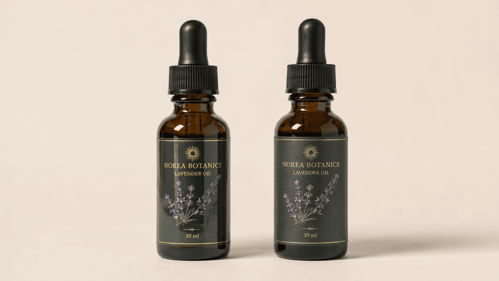
Gloss and matte labels on amber cosmetic dropper bottles

QUICK COMPARISON

Matte vs Gloss Labels at a Glance

The finish should be chosen after the container, artwork, and selling conditions have been considered together. Use this comparison as a practical starting point, then review a physical sample on the final package before production.

FinishVisual EffectOften SuitsCheck Before Choosing
Matte Low-reflection surface with a softer, calmer, more tactile appearance Understated premium packs, natural product lines, and designs with fine text that should stay easy to read under bright light Dark solid colours can show marks differently. Confirm scuff resistance, cleaning conditions, and the final label coating
Gloss Stronger light reflection that can make colour, photography, and metallic details feel more vivid Bright retail packaging, bold graphics, colourful products, and designs that need a polished shelf presence Check glare, text contrast, fingerprints, and whether the retail lighting makes the reflection too strong

A finish is only one part of label performance. The material, varnish or laminate, white ink coverage, adhesive, and package surface can all change the final result.

MATTE AND GLOSS IN USE

How Matte and Gloss Change the Same Label Design

The difference is easiest to see when the bottle, label design, and lighting stay the same. A gloss surface creates a cleaner highlight, while a matte finish softens reflection and changes the overall feel of the package.
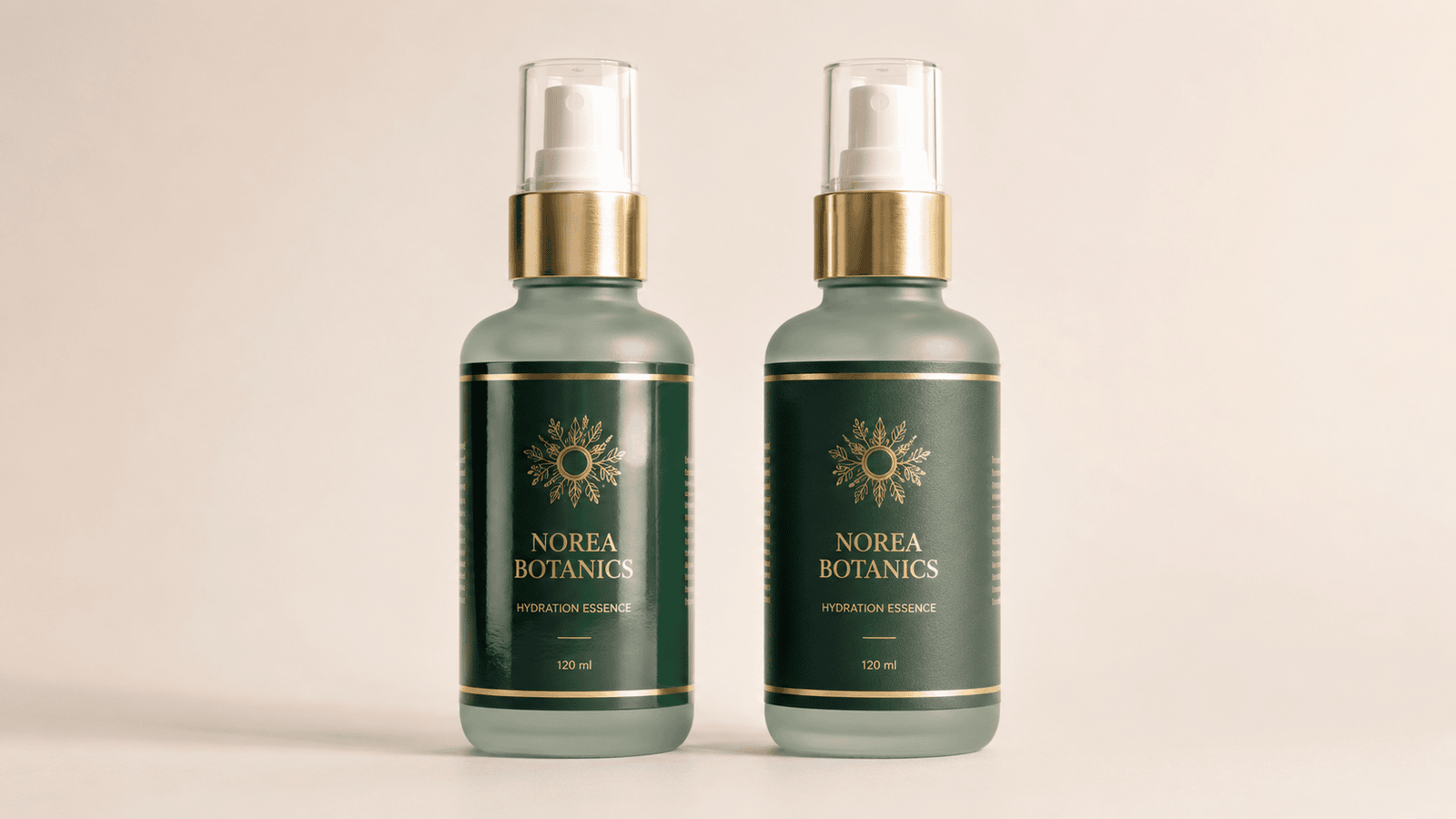
Matte and gloss label finishes on green cosmetic pump bottles
Choose Matte for a Softer, Lower-Glare Finish Matte labels work well for understated cosmetics, natural product lines, and designs with fine text. They reduce visible reflection and create a more tactile, muted presentation.
Choose Gloss for More Colour and Shelf Impact Gloss labels can make colour, photography, and metallic details appear more vivid. They suit packaging that needs a polished, high-energy look, but should be checked under real retail lighting for glare and fingerprint visibility.

BEYOND APPEARANCE

What to Check Before Choosing a Label Finish

Matte vs gloss packaging labels can look very different in a proof, but the final result is shaped by the complete package. Review these practical points before approving a finish for production.

Artwork and Colour Gloss can make saturated colour, product photography, and metallic details feel more vivid. Matte can give refined artwork a quieter appearance. Review dark solid colours, fine lines, and reversed text on an actual printed proof.
Container and Label Material A clear label, curved jar, squeeze tube, or textured bottle changes both reflection and edge visibility. White ink coverage, varnish, laminate, and the package surface can matter as much as the chosen finish.
Handling and Retail Lighting Consider fingerprints, scuffs, glare, and how often the pack will be touched. A matte label vs gloss label comparison should be checked under the lighting conditions where the finished product will sell.
Physical Samples on the Final Pack Apply both options to the final bottle, jar, box, or pouch before production. Comparing real samples helps confirm colour, readability, adhesion, and the overall shelf effect with much more confidence.

FINISH IS NOT THE FULL SPECIFICATION

Gloss or Matte Is Only One Line of the Specification

The visible surface of a label can come from the face stock itself, a varnish, or an overlaminate. Gloss and matte describe the final look, but they do not define the complete material or performance specification.

For example, a gloss film label, a gloss varnish, and a clear label with white ink can all create a polished appearance while behaving differently on a package. The same applies to matte label finishes for packaging: the final feel, durability, and print result depend on the full construction rather than the word “matte” alone.

A clear production brief helps the printer recommend a finish that matches both the artwork and the real conditions of use.

BEFORE YOU APPROVE

Test the Finish on the Final Package

For a matte label vs gloss label decision, a PDF proof is only the first check. It can confirm artwork, but it cannot show how the surface will reflect light, feel in the hand, or perform once it is applied to the real package.

Review both label finishes for packaging on the final bottle, jar, pouch, box, or tube whenever possible. This makes it much easier to choose between matte vs gloss packaging labels with confidence before production begins.

01
Apply Both Finishes to the Final Container

Curves, seams, texture, and package colour can all change how a matte or gloss label appears after application.

02
Check Artwork, White Ink, and Fine Details

Review small type, reversed text, metallic details, transparent areas, and white ink coverage on the actual printed sample.

03
View the Pack Under Real Selling Conditions

Check the label in daylight, retail lighting, and the display environment where glare, colour, and reflection will be seen.

04
Confirm Material and Handling Requirements

Confirm the label stock, adhesive, varnish or laminate, expected moisture, oils, scuffing, and how often the finished pack will be handled.

FREQUENTLY ASKED QUESTIONS

Matte vs Gloss Labels: Frequently Asked Questions

Still deciding between matte and gloss labels? These practical answers cover surface appearance, readability, colour, handling, and why a physical sample should be checked before production.

Matte vs gloss labels mainly differ in how the surface reflects light. Matte diffuses reflection for a softer, lower-glare appearance, while gloss creates a smoother highlight that can make colour, photography, and metallic details look more vivid.

Neither finish is automatically better. A matte label vs gloss label decision should be based on the artwork, container, handling conditions, retail lighting, and the shelf effect you want the package to create.

Often, yes. Gloss can give saturated colours, photography, and metallic details a stronger visual impact. Always review the printed sample under the lighting where the finished product will be displayed, as strong reflection can also create glare.

Matte labels can be easier to read under bright light because they reduce visible reflection. They are often a good choice for fine text, detailed illustrations, understated branding, and packaging that will be handled frequently.

Yes. A digital proof confirms the artwork, but it cannot fully show how label finishes for packaging will look on the real bottle, jar, pouch, box, or tube. Applying both finishes to the final pack is the most reliable way to check colour, reflection, adhesion, and overall appearance.

CUSTOM PRINTED LABELS

Ready to Compare Matte and Gloss Labels for Your Packaging?

PaperMyna supplies custom printed labels with matte and gloss finish options for bottles, jars, tubes, boxes, pouches, and other product packaging. Share your final container, label size, artwork, preferred finish, print details, quantity, and application conditions, and our team can help confirm a practical label specification before production.

Request a Quote Explore Custom Labels

What to Prepare

Container type Container material Label size and shape Artwork file Preferred finish Print colours White ink areas Surface protection Quantity Application conditions